Careful planning can help you redesign corporate without taking up much time, brings higher ROI and help you generate leads.
Why Do You Need to Redesign Corporate Website?
There’s a lot of reasons why you need to redesign the corporate website. Here are a few.
- It’s not talking to your audience.
- Too much about yourself.
- The user flow is confusing.
- It just doesn’t work anymore (technical reasons)
- Poor traffic conversion.
- It’s not helping you get more leads.
- It’s not longer inline with the brand (it’s also backwards-looking)
Whatever the intentions behind the decision to redesign the corporate website, it has to be a valid concern. It can’t be because you don’t like the layout, therefore we change the website entirely.
Revamp, refresh or redesign. Which is it?
Before we get lost in the jargon, let’s try to understand the difference between the three verbs.
- Revamp or redesign (kind of the same) usually implies that it goes through a major overhaul. Changing server, codes and design. This also includes the User Experience, before getting into the website and after leaving it.
- A refresh implies only touch up (cosmetic changes) to make it look ‘interesting’ (which we don’t recommend you to do). Adding a few contents, changing the main page look without interfering with the User Experience.
Refresh can be really quick, 1-2 weeks. While revamp or redesign, can take upwards of 2-6 months depending on the complexity of the website and your business and have a bigger impact on your traffic, marketing, sales automation and revenue. Of course, a website revamp is a lot costlier than a website refresh.
In this post, I’ll be covering corporate website redesign. For a website refresh, you best spare a week or two or hire external help for a quick turnaround.
7 Questions (that needs answers) before you Redesign Corporate Website.
- What are we trying to solve here? – What are the problems you are facing?
- Where is the finishing line? – What’s the definition of a successful website redesign?
- Who is the audience and what do they want?
- What motivates your audience to proceed or quit the website?
- What are the most valuable pages (the one with the highest traffic besides the main page)?
- Example of websites that you like and why?
- Who are the project team members?
Let’s start.
1. What will the new redesign corporate website solve?
Solution without a problem is like shooting a Ghost.
A website solves 3 main problems, communication, marketing and branding.
Communication — A website is 24/7, it runs all the time without taking a break. It may also be the second touchpoint after the first impression (word of mouth, ads, referrals, Google searches). The goal is to communicate as efficiently as possible to convince your audience to take the next step.
Marketing — the single source of truth and as a marketing channel. Which would you believe, a newspaper article about the company or the company website? If it’s not on your company website, then it’s a rumour. e.g. New iPhone is coming. Until Apple publishes on their website, it’s only going be a hearsay.
Branding — to reinforce your positioning. It’s 2020, competitors are on the rise. Everyone can Google how to deliver your solution. You need to tell exactly who you serve, why you do it better and why buy from you.
2. Where is the finishing line?
Unlike printed brochure, a website is a digital document. It has a life.
There are two things you need to consider, when will the website be launched and what are the success measurements?
Launching the Website — When will it be? If it’s too short, then we’ll probably rush into things. If it’s too far, then we’re taking it way too easy, dragging expensive man-hours to fix a single comma on the website. Expect your corporate website redesign to complete within 2-6 months.
Website success — it can be anything, but it has to be attainable (within your control) and measurable. I had people asking for 1 million visitors in 3 days and they never hit 100 per day. Be logical with your goal. Here are some inspirations for your goals.
- Traffic — number of visitors coming to the website.
- Dwell Time — duration of stay on the website.
- Pages per visit — number of pages they visited until they quit.
- Leads — visitors that submit through your contact form.
All of this can be measured easily with Google Analytics.
3. Who is the audience and what do they want?
Let’s face it – Nobody cares about your product. .. Until you care about your customers.
Laman7 have worked with billion-dollar companies to small mom and pop shop, the same occurring problem is not knowing who the audiences are and what do they want?
For the Consumer market, it’s straight-forward, appeal to their inner needs. For Corporate, it gets complicated because the one who browses the website is not the decision-maker. That’s why most business to business or business to government sales cycle can go to months (if not years) for it to be materialized.
Start small. Who are they? Mid managers, young executive, Managing Director, CEO, CMO. How old are they? Age and experience will determine the tone of language, references to pop culture (if any) and use of time (the younger they are, the less they are interested in reading a long document).
What’s bothering them? What’s stopping them from greatness? Understand their disappointment, what are they going through and map their progress to achieving their goals. Big words huh?
Example:
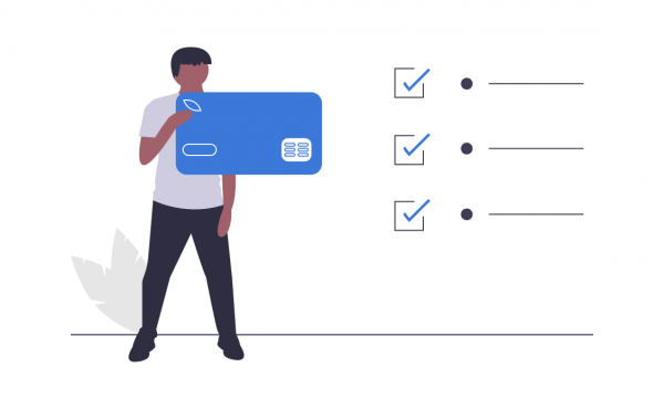
David Lee, 29 Years old, Assistant Sales Manager, 6 years in sales. — We know he has some knowledge of sales. Therefore words like margin, profit, selling price, prospect, lead is normal to him.
Frustrated replying too much email, not much (real) sales activity. — We need to dig deeper into the problem before we can offer a solution. We understood that he spends 2-3 hours daily replying project email that’s not related to sales. Hence, his sales number does not go up. He does not get a raise. He’s frustrated.
The truth is, David Lee is not the only Assistant Sales Manager that faces this problem, the whole world is. His boss probably wants him to do more.
If we can demonstrate how an Automated email solution can solve David Lee’s problem. Help the company save time and make more money, wouldn’t the company be obligated to invest in such a solution? I know I would.
Repeat this step 3-4 times. Get at least 3 audiences (marketers call this personas).
The biggest wrong move is to promote your brand to another brand, like, we are the Number 1 Automation Tool in the World, therefore buy from us. It may work in the 80’s but not in today’s world. Brands need to appeal at an individual level.
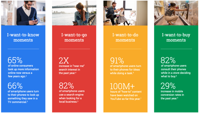
In 2015, research from Google showed four main intent type that drives people to a website.
- I want to know
- I want to go
- I want to do
- I want to buy
What you can learn from this research is that people
- know — are curious to learn about your solution
- go — how to visit your office
- do — use or learn how your solution works
- buy — who to contact to purchase your solution
That’s only the top of the funnel.
Note: Understanding the audience is the most difficult yet rewarding things to do. If you skip this question, you may not bother about redesigning your corporate website at all.
Website is only built for your customers. Not to stroke your ego.
Now that you’ve identified all your audience (persona), it’s time to rank by priority. The simple question, which is the biggest group? — Great, target them. They may not have the buying power, this is where your Sales Kit and soft skills come to play.
Remember, B2B website is not about selling, it’s about qualifying the right people for your solution.
4. What motivates your audience to proceed or quit the website?
One word. Copywriting — will get your audience to engage, stay on the page longer and navigate to other pages.
The biggest misconception about copywriting is to use big words to Wow the audience. Being impressive does not win the sale, in fact, it hinders understanding.
We trace back to our mantra, the true purpose of the website is to communicate. What good is a website if does not send the right message?
So drop the jargon, big words, long paragraphs, abbreviations, and anything that might cause confusion. Use simple, clearer words to convey the message.
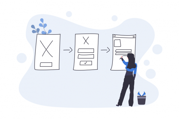
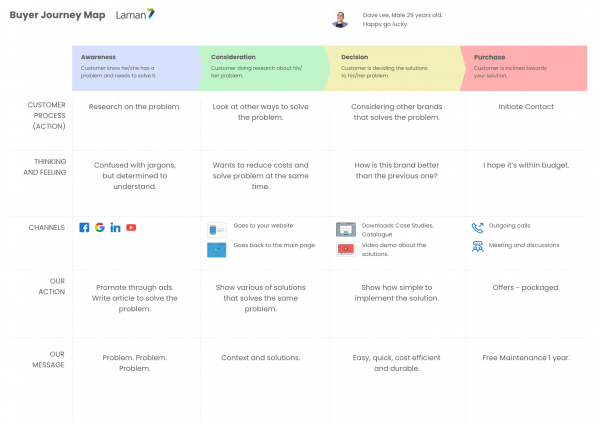
Besides copywriting we can look at using Buyer Journey Map (or Customer Journey Map, or User Journey Map). What we do is get the audience to graduate from one point to another. Why? Because the business customer doesn’t buy immediately after the first visit.
Here’s an example.
You can also download the Buyer Journey template. Start working on it.
86% of visitors who land on a company’s website homepage say they want to see information about the company’s products and services
With proper documentation, you can experiment effectively (fail and learn) the User flow, by changing the content.
5. What are the most valuable pages?
We define value by the number of traffic and conversion.
Traffic — Number of visitors to the web page.
Conversion — % of action taken on page (generally clicks).
List down all pages, then find the traffic and conversion for every single page. You can do this easily with Google Analytics, import into Google Sheets.
Find top 10 valuable pages.
- Try to understand why is the traffic so high?
- How did you acquire traffic for these pages?
- What makes it perform?
- What was the tone (of language) used?
- What is the content?
- Were there any special features?
- What is the Call to Action (CTA)?
We also need to note the Search Engine value of this page. Any wrong move would definitely destroy it’s ranking on Google. You’ll need to take note and do your best to avoid changing the link, content and features.
Sounds like a lot of work? It is and it’s worth it. A new car is not built from scratch but from the market feedback. Data is the meat of any website redesign project.
(Web page is a singular page, whereas the website is the collective web pages)
6. Example of websites that you like and why?
Let’s talk about the future looks.
Good artist copy, GREAT Artist Steal.
Steal inspirations from the best-looking websites in the world. This will drastically cut down the designing duration by 75% compared to designing from scratch.
The problem is, we (web designers) can’t read your mind, preference and taste. You need to show it. It’s easier to digest visually than auditory.
We can also look at top players in your industry. How are they doing it? They’ve done the homework, we could cut down the design work in half by copying the inspiration and User Experience.
List down at least 3 websites and explain why you like these websites.
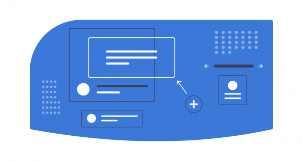
Note: I don’t suggest anything beyond 6 design, it would be too complicated to digest.
7. Who are the project team members to redesign corporate website?
There are usually two sides, one on the business side (you and the rest of the company) and design (usually outsider, web design, web developer, marketers etc). Both need to work together to ensure that you are heading towards the same goal (like no 1).
You should elect 4-7 people to oversee and advise on the redesign corporate website.
- Project Sponsor — The one that makes the decision. Usually the highest-paid person in the room.
- Experienced or Product Specialist — They will help with the product description and how it solves customers’ problem.
- Customer Service — They will help the FAQ (common questions about the website)
- Marketers or Corporate Comm – They will help with the bigger picture of promotion the website and brand identity.
- Sales — They will share common communication with prospects and customers.
Extra: What happens when the website is completed?
Website is like an engine, without fuel it will never run.
What are your plans when you completed the website? How will you be promoting it? There are three ways you can gain traffic.
- Paid Ads Traffic — This is the fastest way to get traffic to your website but also costliest. That’s ok. Because every budget spent on awareness must be converted to a customer. Serve them well, and they will bring their friends in the door too. Your options are Facebook, Google ads, Linkedin ads and Youtube ads.
- Organic Traffic — You can do Search Engine Optimisation (SEO) for your website. SEO is a long term effort. Public Relation works too (if you know the reporters).
- Owned Traffic — These are the traffic that you already have, like email database, social media fans, existing website traffic.
Without traffic, your redesign corporate website is as good as an empty mall. Decide what traffic to invest in and start experimenting.
It may be worrying to invest in traffic if this is your first time, but if you don’t do anything, no one will ever find out about your website. Big outcome, demands big effort.
Another aspect you need to be aware is the maintenance of the website. Who will provision the website, care for it (technically) and additional content you might want to add on your website.
Summary Redesign Corporate Website
We have learned in detailed the steps before you redesign corporate website. I believe I have been detailed the before process. Now you’ve got an idea how to execute your new website.
Best of luck.

